- In this interview with Mongabay India, Andrés Alegría explains how Mongabay harnesses the power of maps and data visuals to give depth to our stories.
- Maps and data visualisations serve as a bridge between complex information and impactful storytelling.
- With AI and machine learning advancing, efficiency in data analysis is improving. But beyond technology, there is a possibility of a shift toward accessibility and inclusivity.
Imagine being a sailor in the 15th or 16th century, setting out on a voyage into the unknown. You’ve heard terrifying tales of sea monsters ruling the oceans, and you can only hope never to encounter one. Perhaps that’s why these maps didn’t just chart coastlines—they also carried cultural knowledge, marking the presence of sea monsters as warnings.

Maps have shaped human history by guiding exploration, trade, and territorial expansion, shaping civilizations along the way. Today, they remain just as vital—powering navigation, urban planning, and environmental conservation in our interconnected world.
At Mongabay India, we leverage maps and data visualisations to enrich environmental storytelling, making complex issues more accessible and engaging. To explore how we bring this to life, we spoke with Andrés Alegría, Graphics Editor for Mongabay News.
The power of maps and data visualisation
“By visualising environmental data such as the spatial distribution of deforestation or pollution hotspots, we help readers to see the ‘bigger picture’ and set into context real-world impacts that are associated with climate change, habitat loss, and extraction of resources, to name a few,” explains Andrés.
Maps and data visualisations serve as a bridge between complex information and impactful storytelling. Mongabay transforms raw data into clear, engaging visuals that not only enhance narratives but also strengthen their credibility, says Andrés.

“Mongabay’s approach to graphics is linked with the narrative. Unlike many other platforms that probably focus on visual flair, the Mongabay graphics are done tailored to the storytelling needed and based on reliable data sources,” adds Andrés.
Mongabay’s commitment to clarity in data visualisation goes beyond aesthetics—it is about making complex environmental issues comprehensible and meaningful. Every graphic starts with rigorous research, ensuring that the data used is both credible and relevant to the story.
“Early consultation lets the editor provide guidance over the best visual approach and might even let one anticipate data problem areas. To make sure its design and sense of storytelling don’t get across each other’s ways, both journalists and graphic editors can frequently have feedback and brainstorming meetings,” explains Andrés.
The key to stronger collaborations between journalists and graphic editors is taking the time to understand each other’s processes. Journalists should go beyond just handing over instructions—they should familiarise themselves with the basics of data visualisation, so they understand what makes a graphic effective.
On the other hand, graphic editors shouldn’t rely solely on a journalist’s directives but should engage deeply with the text drafts, identifying the story’s core elements and determining how best to visualise them, Andrés explains.
Approaching data visualisation
One of the most challenging projects he worked on was an interactive dashboard on India’s air quality, focusing on PM2.5 pollution levels and their link to respiratory diseases. The biggest challenge was integrating multiple datasets with varying levels of detail while ensuring the visualisation remained clear and accessible. Through advanced features in Tableau Public and close collaboration with Mongabay India’s multimedia editor, he created an intuitive and user-friendly tool.
“Close collaboration with Kartik Chandramouli, Multimedia Editor for Mongabay India, was fundamental to make sure that the tool was user friendly. It was a pretty complex and rewarding project that really pushed my technical skills, allowing me to grow as a graphic designer and to approach the following dashboards with more confidence,” says Andrés.
Similarly, for a story on deforestation in Cambodia, Andrés developed three distinct visuals: a bar chart illustrating forest loss, a network diagram mapping the connections between companies and individuals linked to illegal logging, and a layered dataset combining satellite alerts with field data collected by local patrols. Each project required an iterative approach—analysing data, refining designs, and working closely with the editorial team to ensure the visuals seamlessly supported the storytelling.

Tools of the trade
So, how does Andrés bring these visuals to life?
“I work with a diverse “Swiss army” type of toolkit that allows me to survive every project.”
His toolkit is diverse, tailored to each project’s needs. QGIS, an open-source tool, allows for in-depth spatial analysis and is mainly used for maps. For charts and graphs, he often uses RAWGraphs, a web-based tool that exports editable SVG files for further refinement. Adobe Illustrator plays a key role in polishing and branding the final visuals, ensuring they align with Mongabay’s style.
For interactive, web-based visualisations, Andrés uses Tableau Public, a powerful platform that enhances storytelling with dynamic data displays. Each tool serves a distinct function, contributing to the accuracy, accessibility, and impact of the final product.
Becoming a graphic editor
“To become a graphic editor, it’s both an art of design and a technical expertise. The first thing I recommend is to develop a solid background in graphic design through schooling or self-taught. There are plenty of great resources out there, you just have to get started,” recommends Andrés.
Learning data analysis is just as important, with QGIS being a great option for mapping and RawGraphs offering powerful capabilities for handling geospatial datasets. For those interested in interactive visuals, programming skills can be useful, but Tableau Public is an excellent alternative for those who prefer a more user-friendly platform.
Building a portfolio that demonstrates an ability to transform raw data into compelling visuals is key. Practical experience, whether through real-world projects, collaborations with journalists, or mentorship opportunities, helps refine skills and build credibility in the field.
“Finally, maintain your curiosity alive. The field is in continuous development, so keep enhancing your skills and stay tuned to new tools and trends in data visualisation. Combining creative passion with technical proficiency allows you to make a successful career as a graphic editor in today’s data-driven media landscape.”
Future of data visualisation
With AI and machine learning advancing, efficiency in data analysis is improving. But beyond technology, Andrés sees a shift toward accessibility and inclusivity. Ensuring that visualisations are designed for all audiences is crucial for broadening public engagement in environmental issues.
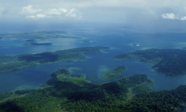
Banner image: Earth from Space. Image by Ars Electronica – Robert Bauernhansl via Flickr (CC BY-NC-ND 2.0).